

The UX Cost of "Just One More Signature"
What we learned reshaping our onboarding around the user

Six months ago, our onboarding flow looked reasonable on paper.
A user would choose a strategy, connect a wallet, sign a message, approve account setup, register storage, grant permissions, fund the account, and then wait for their first swaps to complete.
Every step had a technical reason for being there. The problem was what they added up to.
To us, those were separate blockchain operations. To someone trying Peerfolio for the first time, they were just repeated interruptions.
By the third approval, nobody was thinking about access keys or storage deposits, which we’d hoped they’d never have to think about at all. They were wondering why the app kept asking them to do something else before they could get to what they came for: the strategy someone had shared with them.
Every prompt made sense. Together, they got in the way.
It's an easy trap in blockchain products: you optimize each transaction on its own. This approval is necessary. This one only takes a second. This is the last one, promise.
Every one of those can be true individually. None of them account for what it's like to sit through all of them back to back.
Each approval adds another moment where the user has to stop, interpret what they're seeing, decide whether they trust it, and continue. That cost compounds quickly.
Even when every individual step is reasonable, the overall flow can still feel exhausting.
Watching real people changed our focus
What stood out in testing was how rarely anyone asked us to explain the blockchain. Most of the hesitation came from much simpler questions.
"Did that work?"
"Am I supposed to do something now?"
"Why am I approving this again?"
We saw people reread wallet prompts, pause before continuing, or assume something had failed simply because another approval appeared after the last one.
Reducing the number of approvals helped, but we couldn't remove all of them. So we focused just as much on making the remaining steps predictable and understandable.
What changed in the flow
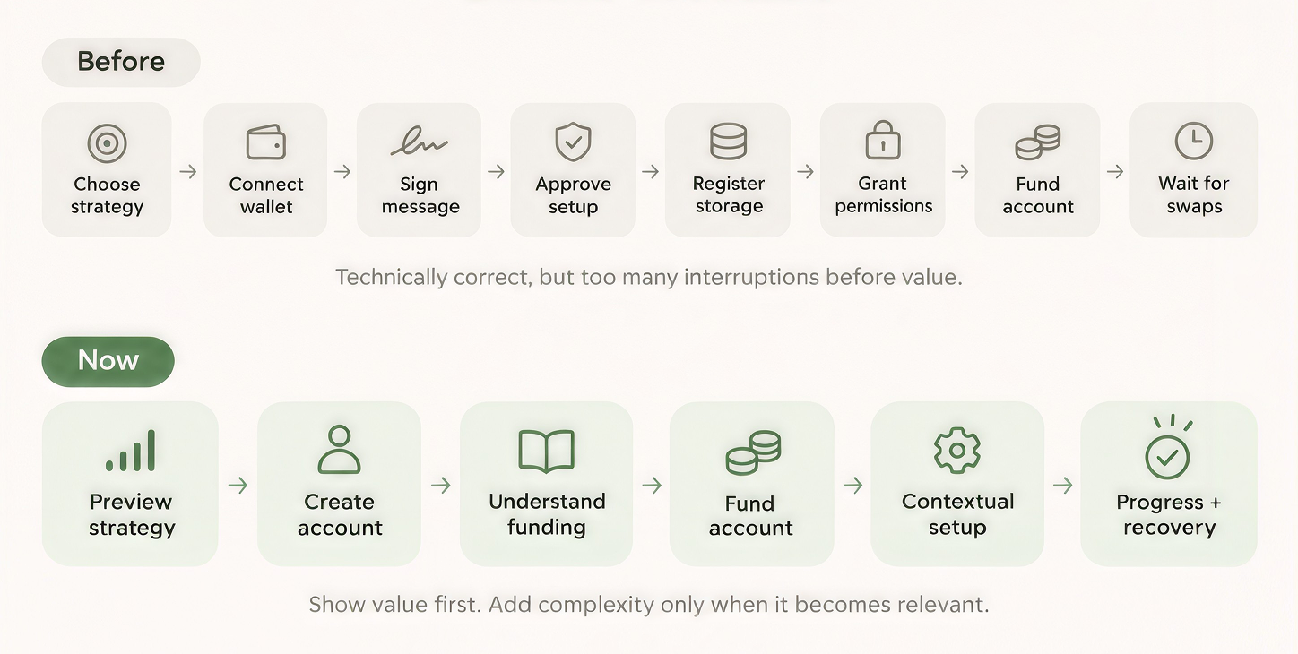
Now, new users first open a shared strategy to understand the purpose of Peerfolio before we ask them to create an account or approve anything.
Let people understand the product first
That was the first big change.
Previously, authentication and setup happened much earlier in the flow. Now, new users start by opening a shared strategy, before we ask them to create an account or approve anything.
They can preview the strategy, see how it's put together, and understand what they are signing up for. We want them to have something concrete to evaluate before we ask them to commit.
Give context before an unfamiliar handoff
Funding comes next, and we changed how we introduce that too.
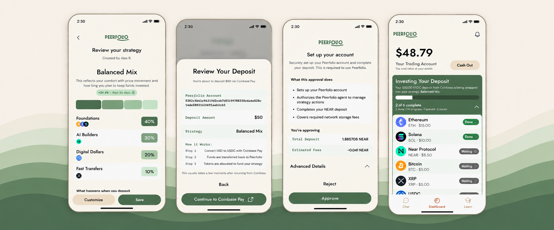
Before sending users to Coinbase or asking them to approve a wallet transaction, we explain what's about to happen, why it's required, the minimum amount needed, and which account they're funding.
That bit of context makes the handoff feel much less abrupt.
We use the same idea before approval screens during setup. Instead of dropping people directly into a wallet prompt, we explain what they're about to approve and why.
This context works best before the handoff. Once someone is unexpectedly staring at an unfamiliar wallet prompt, we're already playing catch-up.
Make the remaining steps readable and recoverable
There is still blockchain work after the deposit lands.
We create the trading account and ask the user to authorize the specific permissions Peerfolio needs to carry out the strategy they selected. Those steps still exist. We just moved them later, after the user has seen enough of the product to understand why they're being asked.
We also improved the parts we couldn't remove:
- The approval screen now explains in plain-English what's being approved instead of showing raw transaction data.
- During funding, we show progress as the deposit is detected, the account is set up, and swaps begin, instead of a generic loading state.
- If a user closes the window, returns from Coinbase late, or something gets out of sync, Peerfolio picks up where they left off and continues instead of making them start over.
Most of that work is invisible, and ideally users never have to think about it.
It's progressive disclosure applied to blockchain: show complexity when it becomes relevant to the person, not just because it happens to come next in the architecture.
Simplicity shouldn't cost people their ownership
One thing we weren't willing to obscure was ownership.
Users remain the owners of their accounts and assets. During setup, they grant Peerfolio the permissions required to carry out the actions they authorize.
Simplifying onboarding couldn't mean pretending those permissions didn't exist. It meant making them understandable at the moment they became relevant.
The hard part was figuring out when the blockchain needed to be visible, and when showing it was just us leaking our own architecture into someone else's experience.
Designing around the user, not the architecture
Crypto products have spent a lot of time teaching people how blockchains work. Our experience has made us question how much of that knowledge should really be a prerequisite for using one.
Good onboarding doesn't hide complexity. It decides when that complexity actually matters to the person in front of you.
Looking back, too many signatures were only part of the problem. The bigger issue was that our onboarding followed our architecture more closely than it followed the user's mental model.
Nobody is going to remember that an access key had to exist before we could deploy a trading account. They'll remember whether they felt like they knew what they were doing.
Comments
Join the discussionThe distinction between a flow that looks reasonable on paper and one that feels like a string of interruptions is the useful part. Each approval had its own reason, but by the third one the person is no longer thinking about keys or deposits; they are wondering why they still cannot start. Letting someone see the product before the unfamiliar handoff, and making the remaining steps readable if they need to recover, treats the sequence as one experience rather than a list of operations. Keeping ownership in the user's hands while doing that is a hard line, and it is the right one to hold.
A useful way to decide whether a signature belongs in onboarding is to treat each one as a hypothesis, not a default. Map the flow and label every request by who needs it, what risk it controls, and whether it can happen later. Then compare completion and drop-off immediately before and after each step, split by first-time vs returning users and by device. For low-risk steps, test moving the request until the user actually needs the feature; for high-risk ones, explain the reason in plain language before asking. Keep a short weekly review of completion, support tickets, and any fraud or compliance incidents so removing friction doesn’t quietly shift costs elsewhere.